TFL Sharing Bikes
Publish date: Sep 11, 2021Tags: R Data Analytics Data Visualization traffic
Excess rentals in TfL bike sharing
Recall the TfL data on how many bikes were hired every single day. We can get the latest data by running the following
url <- "https://data.london.gov.uk/download/number-bicycle-hires/ac29363e-e0cb-47cc-a97a-e216d900a6b0/tfl-daily-cycle-hires.xlsx"

# Download TFL data to temporary file
httr::GET(url, write_disk(bike.temp <- tempfile(fileext = ".xlsx")))
## Response [https://airdrive-secure.s3-eu-west-1.amazonaws.com/london/dataset/number-bicycle-hires/2021-08-23T14%3A32%3A29/tfl-daily-cycle-hires.xlsx?X-Amz-Algorithm=AWS4-HMAC-SHA256&X-Amz-Credential=AKIAJJDIMAIVZJDICKHA%2F20210916%2Feu-west-1%2Fs3%2Faws4_request&X-Amz-Date=20210916T224948Z&X-Amz-Expires=300&X-Amz-Signature=99861546c48d137faf345fbc47d3264523d78f47325fd737c8fb8d05df9a0f71&X-Amz-SignedHeaders=host]
## Date: 2021-09-16 22:50
## Status: 200
## Content-Type: application/vnd.openxmlformats-officedocument.spreadsheetml.sheet
## Size: 173 kB
## <ON DISK> /var/folders/z6/38vlnmk90hl02593lwyf2k800000gn/T//Rtmphrw6H6/file6d1a170165fd.xlsx# Use read_excel to read it as dataframe
bike0 <- read_excel(bike.temp,
sheet = "Data",
range = cell_cols("A:B"))
# change dates to get year, month, and week
bike <- bike0 %>%
clean_names() %>%
rename (bikes_hired = number_of_bicycle_hires) %>%
mutate (year = year(day),
month = lubridate::month(day, label = F),
week = isoweek(day))We can easily create a facet grid that plots bikes hired by month and year.

- In May and June of 2020 there is a huge decline in bike rentals due to the pandemic.
We will now reproduce the following graph. The graph looks at the monthly change in TfL from the monthly averages calculated in 2016-2019. The blue line is the mean bike rentals of the months over 2016-2019. The red shaded region shows the months where the monthly rentals fell below the average and the green shows the months where it was above the average.

# Calculates the average monthly bikes rented using data from 2016 to 2021.
expected_hires <- bike %>%
  filter(day>="2016-01-01")%>%
  group_by(year, month) %>%
  summarize(bikes_hired = mean(bikes_hired)) %>%  #takes the daily data and creates a monthly mean for each year/month combo
  group_by(month) %>%
  summarise(expected_hired = mean(bikes_hired)) #outputs mean bike rentals by month (Jan-Dec) with only 12 rows
## `summarise()` has grouped output by 'year'. You can override using the `.groups` argument.#modifying the dataset and adding the averages previously calculated in expected_hires
plot_bike <- bike %>%
filter(day>="2016-01-01")%>%
group_by(year, month) %>%
summarize(bikes_hired = mean(bikes_hired)) %>% #gets the average bikes for each year/month combo 1/2016, 2/2016 ....
inner_join(expected_hires, by = "month") %>% #adds column with the average bike rentals to each year/month combo
mutate(fill = bikes_hired>expected_hired, #creates a True/Flase column if bikes rentals are above or below the average
up = ifelse(bikes_hired>expected_hired, bikes_hired-expected_hired, 0), #calculates if above the average and the number of rentals above, if it is not 0 is given.
down = ifelse(bikes_hired>expected_hired, 0,bikes_hired-expected_hired), #calculates if below the average and the number of rentals below, if it is not 0 is given.
Month = month(month, label=T)) #gets the month value in chr format## `summarise()` has grouped output by 'year'. You can override using the `.groups` argument.plot_bike$lower = apply(plot_bike[,3:4],1,min) # creates a column taking the smallest value from actual vs average bikes hired
plot_bike$higher = apply(plot_bike[,3:4],1,max) # creates a column taking the largest value from actual vs average bikes hired
plot_bike$date = ym(paste(plot_bike$year,plot_bike$month)) #creates column with date in ym format
#Recreating the plot
plot_bike %>%
ggplot(aes(x=Month)) +
geom_line(aes( y=expected_hired, group=year),colour="blue",size=2)+ #draws the average
geom_line(aes(y=bikes_hired, group=year),colour="black",size=.5)+ #draws the actual bikes hired
geom_ribbon(aes(ymin=expected_hired,ymax=expected_hired+up, group=year),fill="#7DCD85",alpha=0.4) + #creates green shaded
geom_ribbon(aes(ymin=expected_hired,ymax=expected_hired+down, group=year),fill="#CB454A",alpha=0.4)+ #creates red shaded
facet_wrap(~year)+ #creates plots for years
theme(axis.text.x = element_text(angle=60 , hjust=1) ) +
# theme_bw() +
labs(title = "Monthly changes in TfL bike rentals",
subtitle = "change from monthly average shown in blue and calculated between 2016-2019", caption= "Source: TfL, London Data Store",
x="", y="Bike Rentals") +
NULL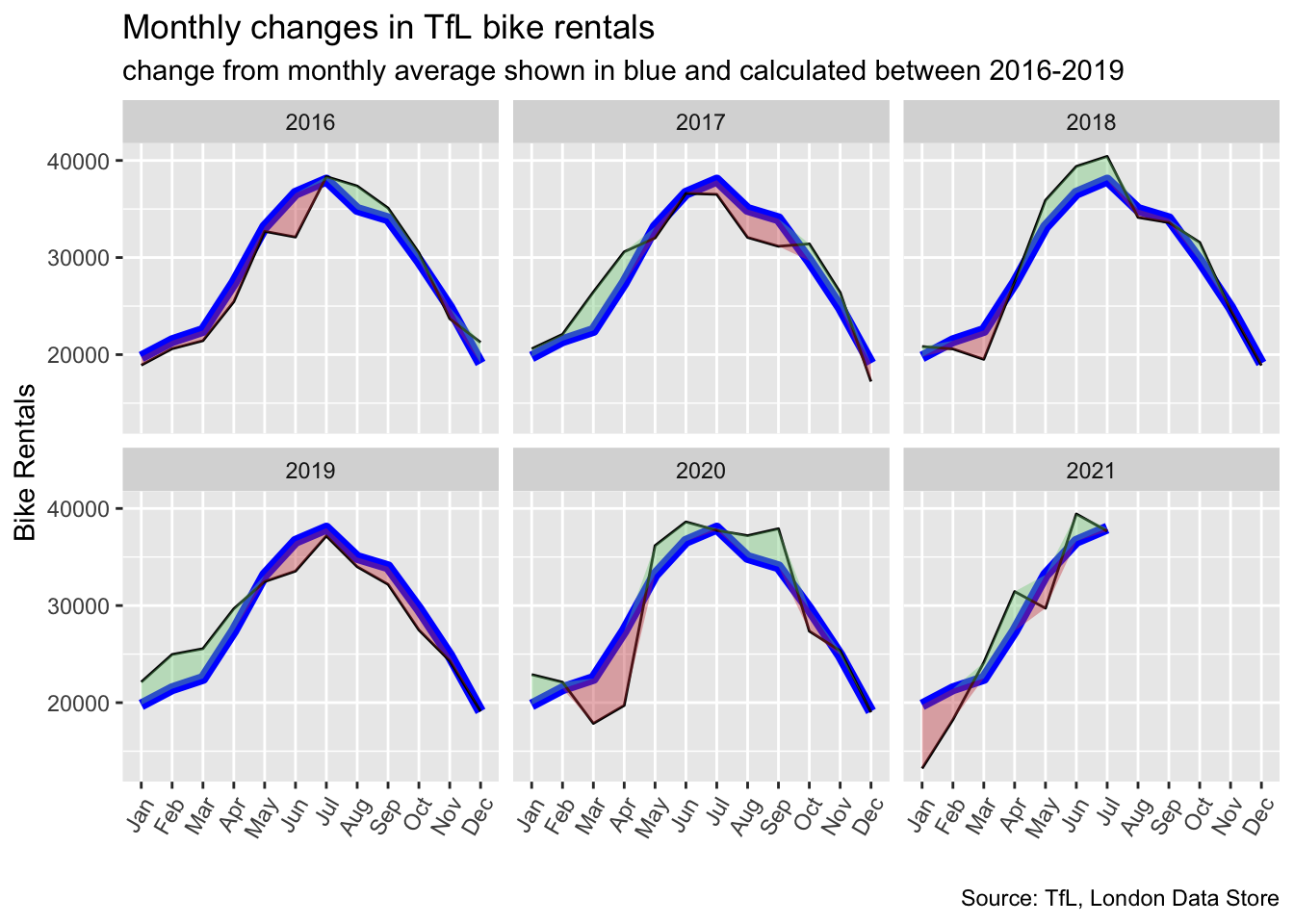
The second graph we recreated looks at percentage change from the expected level of weekly rentals. The two grey shaded rectangles correspond to Q2 (weeks 14-26) and Q4 (weeks 40-52).

Here the green shaded region shows the percentage of rentals above the average and the red shows the percentage below.
#Calculating the weekly means
expected_hires_week <- bike %>%
  filter(day>="2016-01-01" & day<"2020-01-01")%>%
  group_by(year, week) %>%
  summarize(bikes_hired = mean(bikes_hired)) %>%  #takes the daily data and creates a weekly mean for each year/week combo
  group_by(week) %>%
  summarise(expected_hired = mean(bikes_hired)) #outputs mean bike rentals by week with 53 rows
## `summarise()` has grouped output by 'year'. You can override using the `.groups` argument.#modifying the dataset and adding the averages previously calculated in expected_hires
plot_bike_week <- bike %>%
filter(day>="2016-01-01")%>%
filter(!(year==2021 & week==53)) %>% # gets rid of week 53 in 2021 causing weird line in plot.
group_by(year, week) %>%
summarize(bikes_hired = mean(bikes_hired)) %>%
inner_join(expected_hires_week, by = "week") %>% #joins the two datasets (one with mean) by week
mutate(fillcolor = bikes_hired>expected_hired,
excess_rentals = bikes_hired - expected_hired, #calculates rentals above average
percentage_change_expected = (excess_rentals/expected_hired), #calcualtes percentage above avg
up = ifelse(percentage_change_expected>0, (excess_rentals/expected_hired), 0),
down = ifelse(percentage_change_expected>0, 0,(excess_rentals/expected_hired)))## `summarise()` has grouped output by 'year'. You can override using the `.groups` argument.plot_bike_week$lower = apply(plot_bike_week[,3:4],1,min) # creates a column taking the smallest value from actual vs average bikes hired
plot_bike_week$higher = apply(plot_bike_week[,3:4],1,max) # creates a column taking the largest value from actual vs average bikes hired
plot_bike_week %>% ggplot(aes(x=week, y=percentage_change_expected)) +
annotate(geom="rect", xmin = 14,xmax = 26, ymin=-Inf, ymax=Inf, alpha=0.1) + #Q2
annotate(geom="rect", xmin = 40,xmax = 52, ymin=-Inf, ymax=Inf, alpha=0.1) + #Q4
geom_line(aes(x=week, y=percentage_change_expected)) + #Creates average line
geom_ribbon(aes(ymin=0,ymax=up, group=year),fill="#7DCD85",alpha=0.4) + #adds green shaded
geom_ribbon(aes(ymin=0,ymax=down, group=year),fill="#CB454A",alpha=0.4)+ #adds red shaded
geom_rug(aes(x=week), color=ifelse(plot_bike_week$fillcolor,"#7DCD85","#CB454A"), sides="b") +
facet_wrap(~year) +
scale_y_continuous(labels = scales::percent) + #adds percent on axis
theme_bw() +
theme(legend.position = "none") +
labs(title = "Weekly change in TfL bike rentals",
subtitle = "% change from weekly averages calculated between 2016-2019",
y="")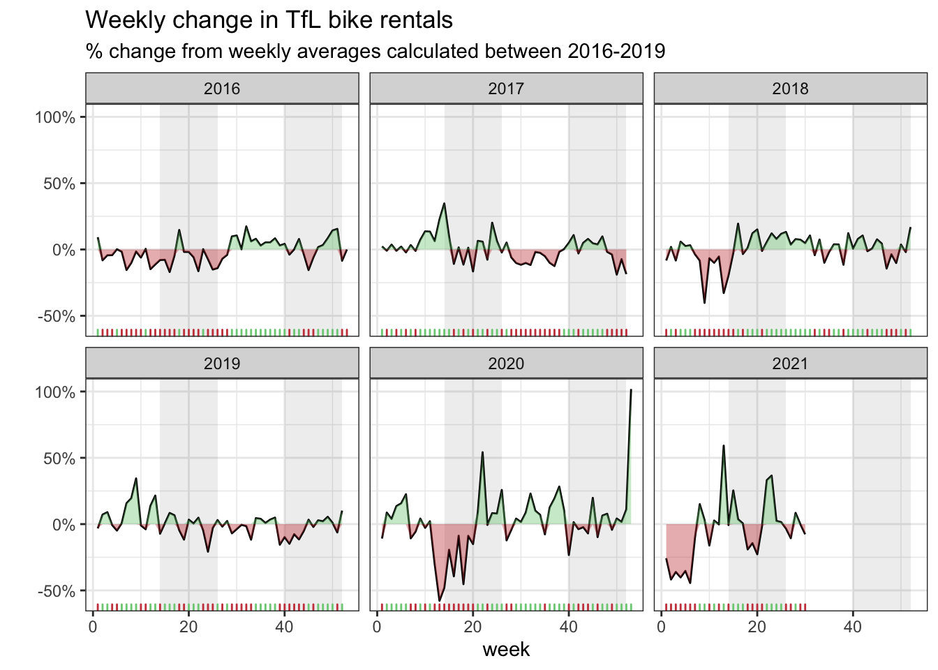
Here we discuss whether to use the mean or the median to calculate your expected rentals and why.
- In our graphs we calculate the expected number of rentals per week or month between 2016-2019 and then, see how each week/month of 2020-2021 compares to the expected rentals. Think of the calculation
excess_rentals = actual_rentals - expected_rentals. - The bike rentals seem to be normally distributed and the mean is a good representation of the population mean.
- The graphs are identical when the mean is used and since we are trying to replicate the graphs we have used the mean.